For Glacine, I wanted the identity to feel instantly like ice cream, but still look clean and designed, so I built the logo around a simple cone and swirl icon. The swirl is drawn with smooth, flowing curves to mimic the way soft serve actually looks, which makes the mark feel creamy and satisfying even before you read the name. I also kept the icon mostly one solid shape so it stays strong at small sizes, which is important for things like stickers, cup stamps, social icons, and menu headers.
The circle “swoosh” around the cone was a purposeful choice because it adds motion and energy to the mark. It feels like a quick, confident sweep, which makes the logo look more dynamic than a static ice cream symbol. That circular form also helps the icon work like a badge, so it can live on packaging and signage without needing extra layout support. It creates a clear container for the icon, which makes the brand feel more recognizable and consistent across different backgrounds.
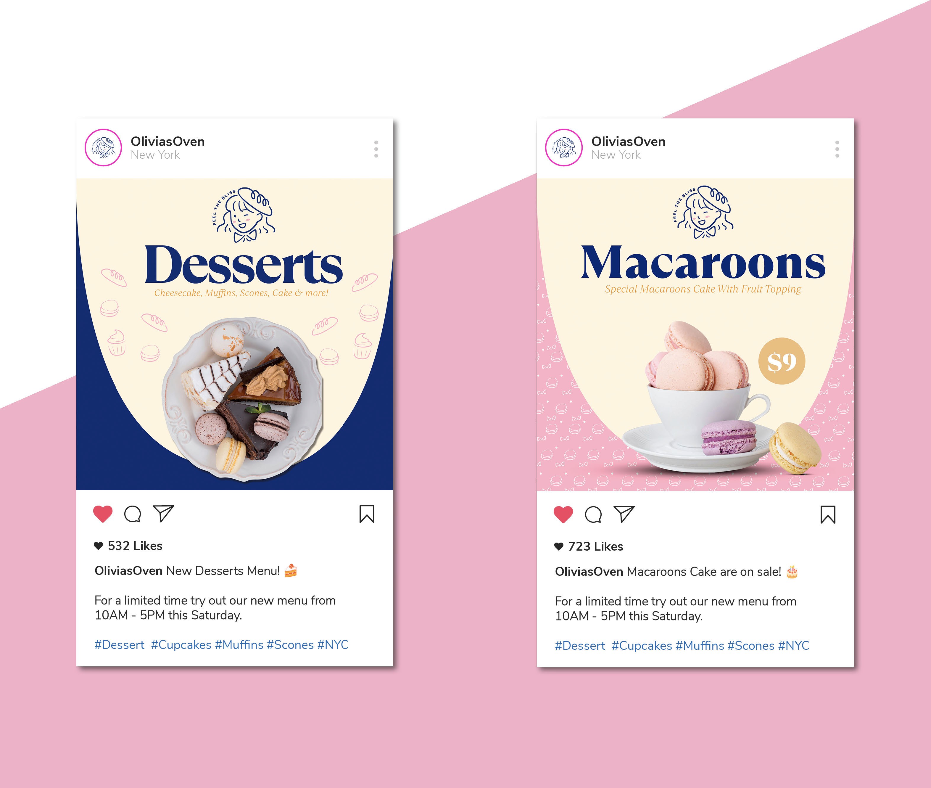
For the Glacine branding, I leaned into a fun, playful color system because ice cream is emotional and visual first. You usually choose a flavor with your eyes, so the palette was designed to feel bright, happy, and instantly craveable. Each flavor gets its own color world, which makes the lineup easy to understand at a glance and helps the products feel collectible, like you want to try all three.
For the Glacine branding, I leaned into a fun, playful color system because ice cream is emotional and visual first. You usually choose a flavor with your eyes, so the palette was designed to feel bright, happy, and instantly craveable. Each flavor gets its own color world, which makes the lineup easy to understand at a glance and helps the products feel collectible, like you want to try all three.
#01
Logo Concept
Logo Concept
The Olivia’s Oven logo was designed to feel like a small, handmade bakery you can trust, so I built it around a friendly illustrated character instead of a generic baking icon. The girl represents “Olivia” in a simple line style that feels personal and crafted, like it was sketched by hand the same way the desserts are made by hand. I gave her a wink to add warmth and personality, because it makes the brand feel welcoming and playful, like there is a real person behind the oven who is proud of what they make.
The baguette hat was a purposeful storytelling detail. It signals baking, but in a clever way that feels unique to this brand instead of something you have seen many times before. It blends the idea of a baker’s hat with a recognizable baked good, so the concept reads quickly even at small sizes. It also creates a memorable shape that works well on the website, on stickers, on packaging, and on social media.


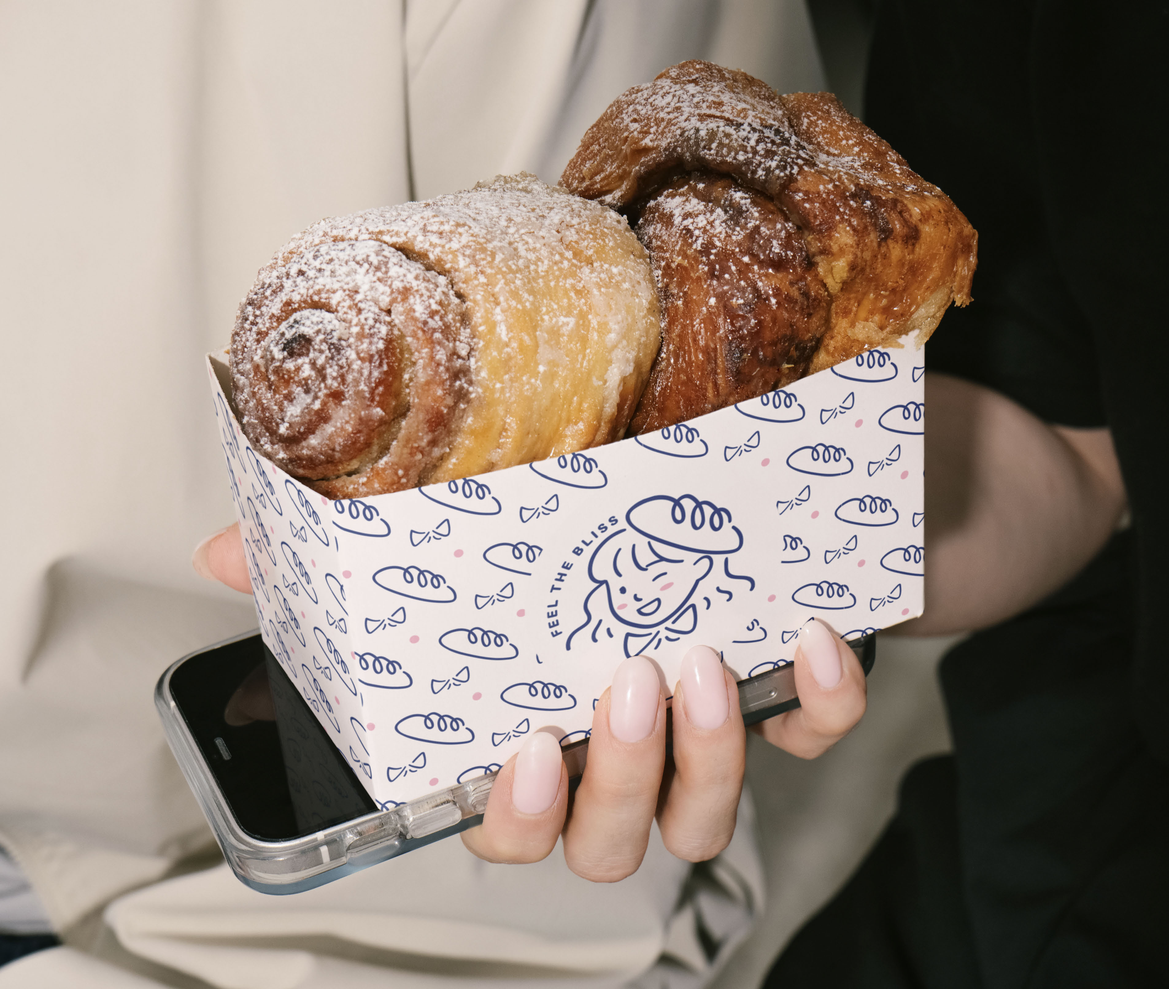


I kept the color pink and blue to make the brand feel clean, confident, and dependable, which matters for food brands where trust is important. The pink accents were used lightly to bring in sweetness and softness without taking over the design, so the logo stays crisp and easy to read. Overall, the hand drawn illustration, the playful wink, and the baguette detail create a logo that feels approachable, charming, and clearly made by hand.
#01
Logo Concept
Logo Concept
For Eluvia, I chose green because In skincare, green reads as fresh and restorative, which supports the idea of gentle formulas and plant based ingredients. It also builds trust visually, because the color feels grounded and stable instead of loud or trendy, which helps the brand feel like something you can use every day.
The leaf inside the “e” was a way to connect the name directly to skincare without adding extra icons around it. By building the leaf into the letterform, the logo becomes a symbol and a wordmark at the same time, so it feels more custom and more ownable. It works like a signature detail you start to recognize quickly, and it reinforces the idea that the brand is rooted in botanicals and natural care. The curved “e” shape also creates a smooth, flowing motion that fits skincare, since the product experience is about softness, comfort, and ease.


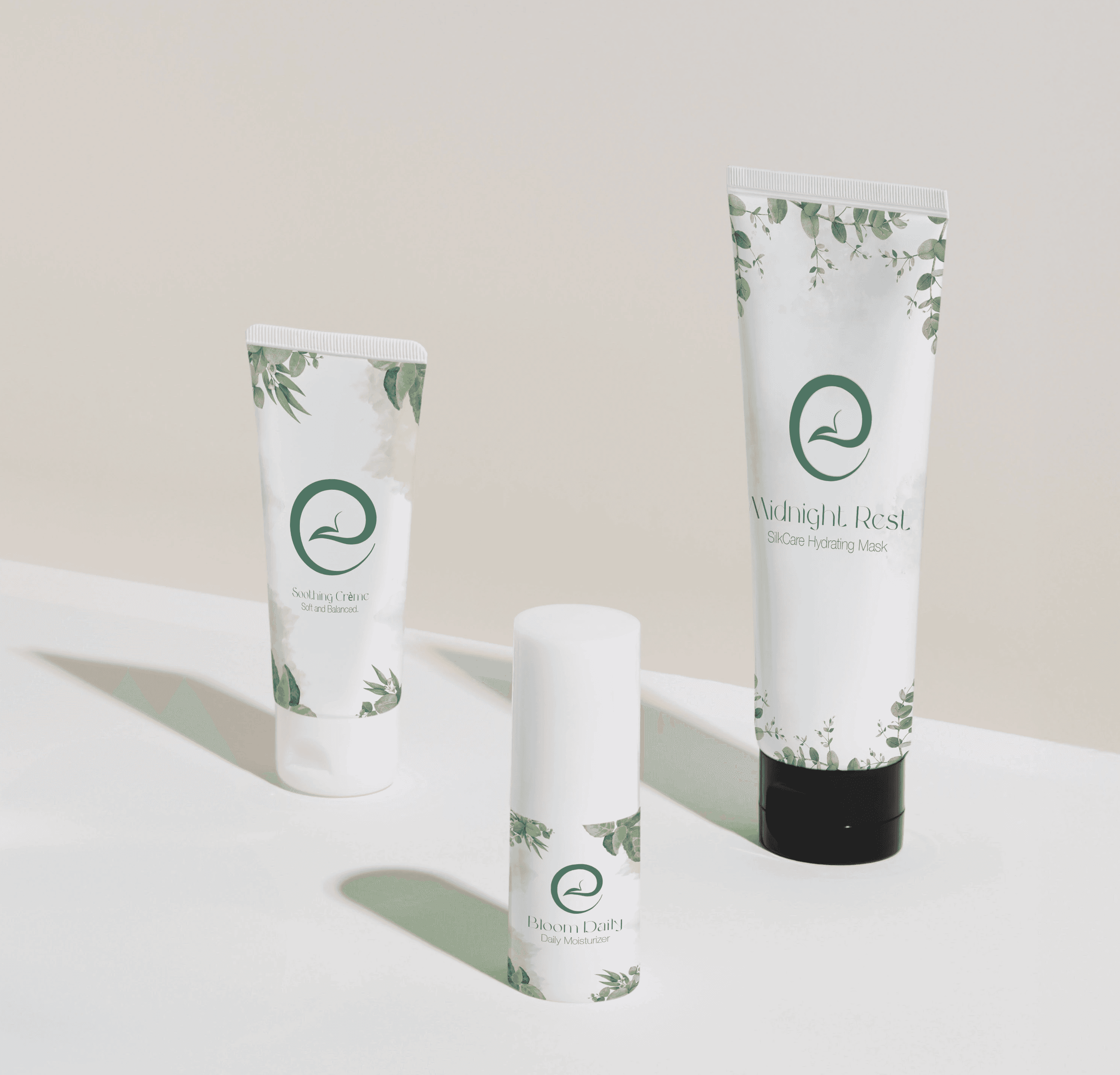


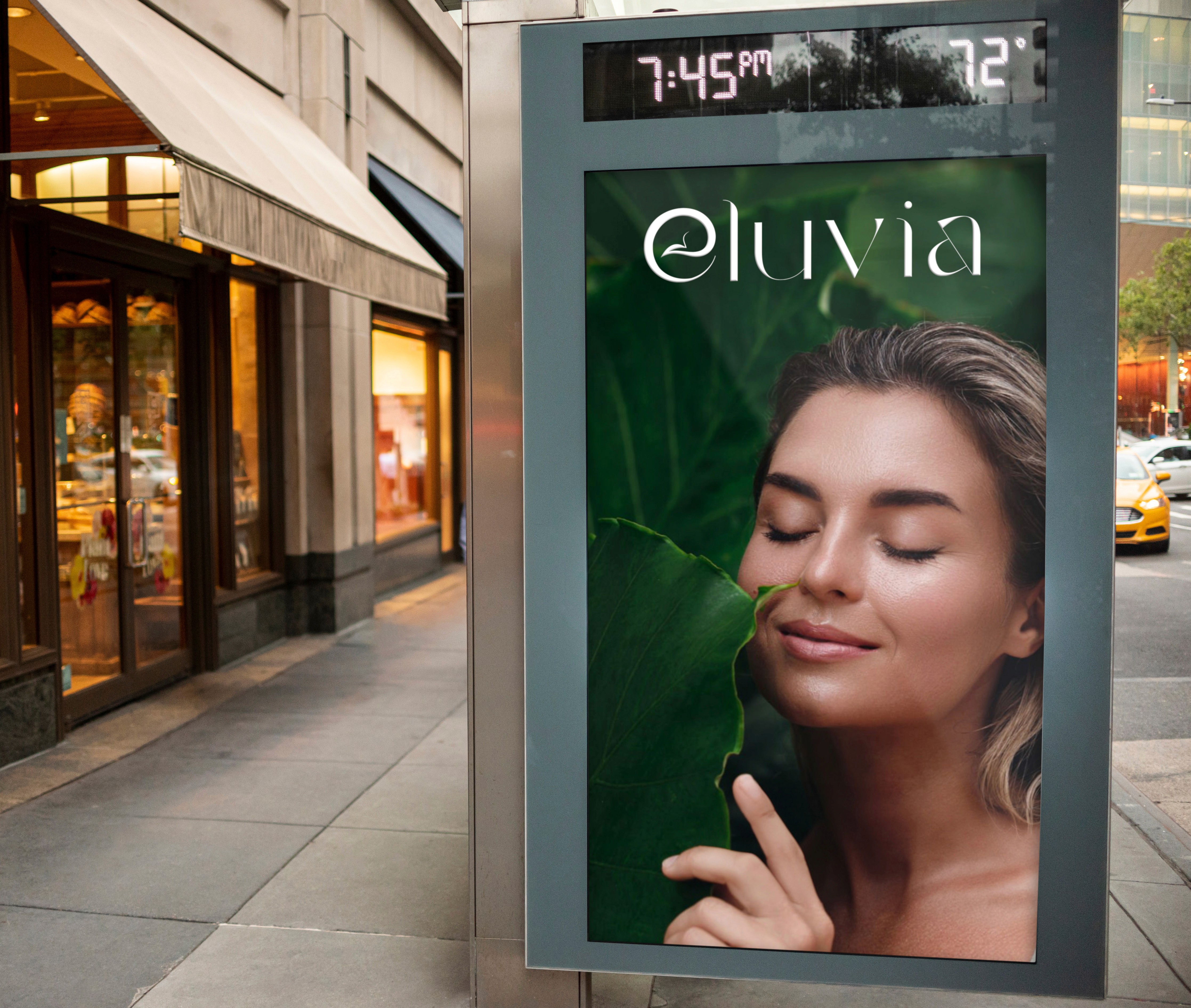
The overall branding leaning into leaves and green keeps the identity consistent across everything. That leaf motif can expand into patterns, textures, and small supporting graphics for packaging, labels, and social posts, while the monogram version of the “e” gives you a clean mark that scales well for icons, seals, and product stamps. Together, the system feels minimal, natural, and premium, which is exactly what you want for a skincare brand that is plant inspired and intentional.
The overall branding leaning into leaves and green keeps the identity consistent across everything. That leaf motif can expand into patterns, textures, and small supporting graphics for packaging, labels, and social posts, while the monogram version of the “e” gives you a clean mark that scales well for icons, seals, and product stamps. Together, the system feels minimal, natural, and premium, which is exactly what you want for a skincare brand that is plant inspired and intentional.
The pastel backgrounds were chosen to keep everything light and friendly while letting the ice cream texture stay the hero. They also give the brand a modern, pop style that feels fresh instead of traditional. I paired the colors with bold, sticker like typography and thick outlines to make the flavor names feel loud in a good way, almost like packaging you would see in a trendy shop or on social media. That outlined, cutout look adds energy and makes each flavor label feel like its own graphic moment.
Even though the colors shift by flavor, the system stays consistent through repeated elements like the same cone layout, the drip detail, and the Glacine mark. That balance is what keeps it playful without looking messy. It feels fun and expressive, but still designed and organized, which is what you want for an ice cream brand that needs to stand out fast.

Non Profit Branding
Non Profit Branding
Non Profit Branding
New Settlement: A New Look, Same Mission.
New Settlement:
A New Look, Same Mission.
New Settlement: A New Look, Same Mission.
#01
Logo Concept
For Eluvia, I chose green because In skincare, green reads as fresh and restorative, which supports the idea of gentle formulas and plant based ingredients. It also builds trust visually, because the color feels grounded and stable instead of loud or trendy, which helps the brand feel like something you can use every day.
The leaf inside the “e” was a way to connect the name directly to skincare without adding extra icons around it. By building the leaf into the letterform, the logo becomes a symbol and a wordmark at the same time, so it feels more custom and more ownable. It works like a signature detail you start to recognize quickly, and it reinforces the idea that the brand is rooted in botanicals and natural care. The curved “e” shape also creates a smooth, flowing motion that fits skincare, since the product experience is about softness, comfort, and ease.
The overall branding leaning into leaves and green keeps the identity consistent across everything. That leaf motif can expand into patterns, textures, and small supporting graphics for packaging, labels, and social posts, while the monogram version of the “e” gives you a clean mark that scales well for icons, seals, and product stamps. Together, the system feels minimal, natural, and premium, which is exactly what you want for a skincare brand that is plant inspired and intentional.

0
+
Followers
0
+
Followers
0
+
Followers
0
%
Email Open Rate
0
%
Email Open Rate
0
%
Email Open Rate
0
%
Higher Class Enrollment
0
%
Higher Class Enrollment
0
%
Higher Class Enrollment
0
%
Engagement Increase
0
%
Engagement Increase
0
%
Engagement Increase

New Settlement serves the Bronx community, but their visuals didn’t fully reflect the energy and impact of their work. That’s where my focus came in, making the brand look as strong as the mission.
The result: follower growth and more program registrations, but most importantly, reaching Bronx families who needed these resources and events.
#01
Social Media
Social Media
Social Media
When I began managing New Settlement’s social media, the feed relied heavily on graphic-based holiday posts (Earth Day, Easter, awareness days). While the messaging was positive, performance showed the strategy wasn’t working. Most posts averaged 4–10 likes which signaled a low-engagement content mix.
To improve results, I started with research and performance review to understand what was working and why. This is where I:
• Reviewed New Settlement’s highest-performing posts to identify patterns (format, visuals, captions, themes)
• Looked at similar nonprofit Instagram accounts to compare content approach, storytelling style, and posting strategy
Thats when i realized the highest performing content consistently featured real event photography, staff in action, community members participating, and moments that showed the organization’s impact. People were more likely to interact with content that highlighted real moments and outcomes, rather than holiday graphics or reminders.
Before After
Before After

After

Before
Instagram Follower Growth
Instagram Follower Growth
Instagram Follower Growth

#02
Improved Visual Design
Improved Visual Design
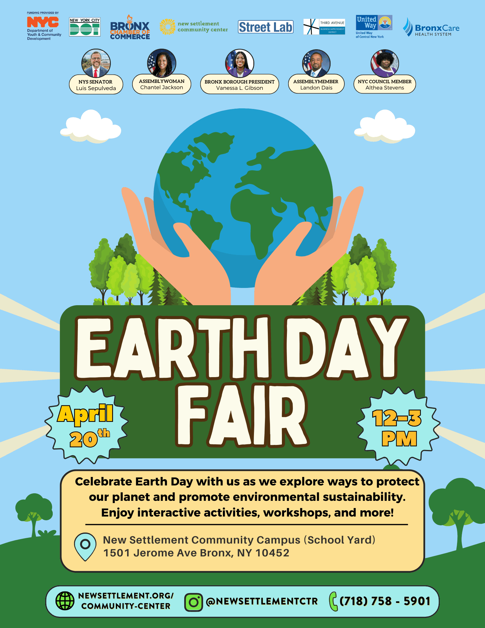
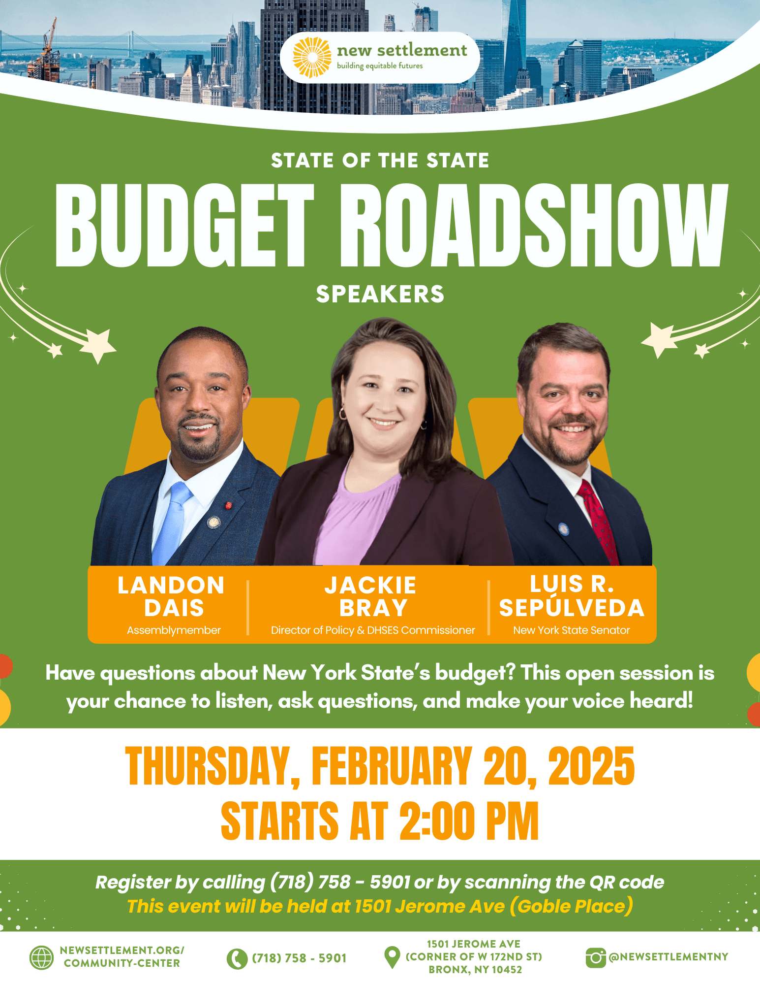
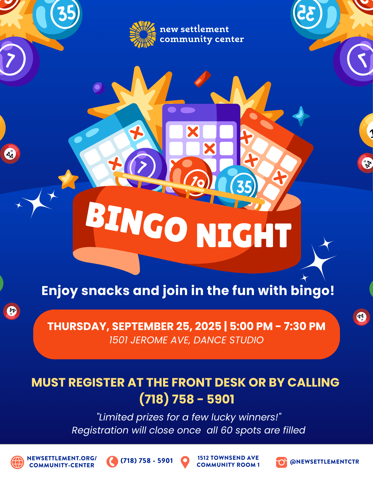
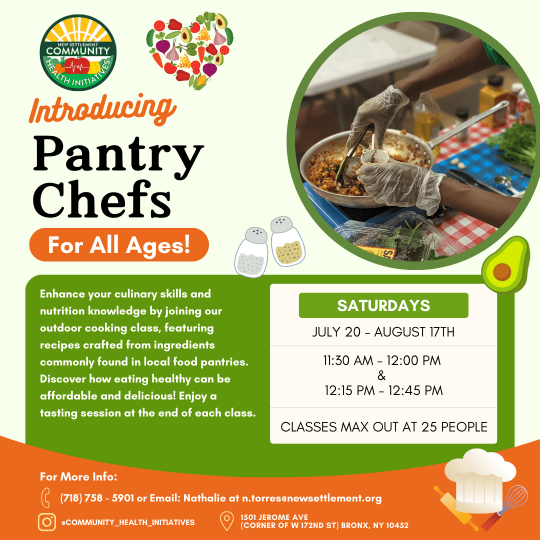
I also knew New Settlement still needed graphic posts to promote events, but the existing designs were hard to read and packed with extra information. The hierarchy was unclear, and too much extra information made the key details easy to miss.
I fixed this by redesigning the graphics with a modern, parent friendly approach using cleaner layouts, easy to read fonts, and on brand color. I also simplified the copy so the most important information stood out first, making each social media post faster to understand.
Before
Before


After
After

#03
Email Marketing
Email Marketing
New Settlement’s emails were reaching a large list, but the message wasn’t turning into enrollments the way it should. Spots in key programs were not being filled, and that wasn’t just a marketing problem to me. It meant families who could benefit from affordable programs weren’t being reached in the right way, and kids were missing opportunities that support confidence, health, and structure.
That’s why I focused on email marketing. With 10,000 subscribers, the average open rate was only about 25%, which signaled that people were either not noticing the emails or not feeling pulled in enough to open them.
I approached it like a campaign, not a one-off announcement. I upgraded the visuals for each program and designed emails that made the value obvious to a parent within seconds. For example, I created a clean one-page layout that highlighted the benefits parents care about most, using strong hierarchy, colorful design, real photos, and a simple benefit section at the bottom. Even when people already “know” there are benefits, seeing them clearly laid out makes the decision easier.
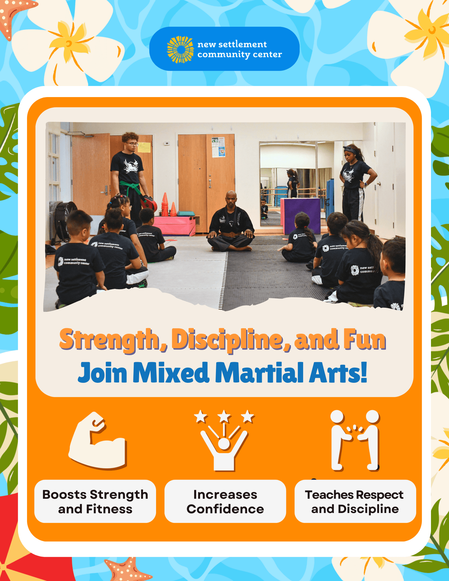


To increase email open rates, I focused on what drives the click in the inbox: short subject lines, clear preview text, and parent-focused wording. I reviewed past sends, identified patterns in what performed best, and then rewrote the subject lines so they were easy to understand at a glance, especially on mobile. I also used preview text to hold the key details and the next step (like enrolling), instead of cramming everything into the subject line.
For example, instead of a vague or long subject line, I used something direct and specific:
Subject: “Mixed Martial Arts for Kids! 🥋”
Preview text: “Registration Starts Jan 1st"
I tracked performance after each send and continued iterating based on what improved opens. By tightening the inbox messaging and making the email immediately relevant to parents, I was able to lift open rates above the 36% baseline and support stronger interest in program enrollment.
#04
Improved Photography
Improved Photography
Photography became one of the most important parts of strengthening New Settlement’s brand because it instantly showed the real story behind the work. Graphics can share information, but photos build trust. They show real people, real programs, and real impact, which makes the organization feel more credible and more human.
All of the photos used for this strategy came directly from me. I attended events in person, documented programs firsthand, and captured the moments that best reflected the mission. That mattered because it kept the visuals authentic and consistent, instead of relying on stock images or random photos that don’t match the organization’s voice.


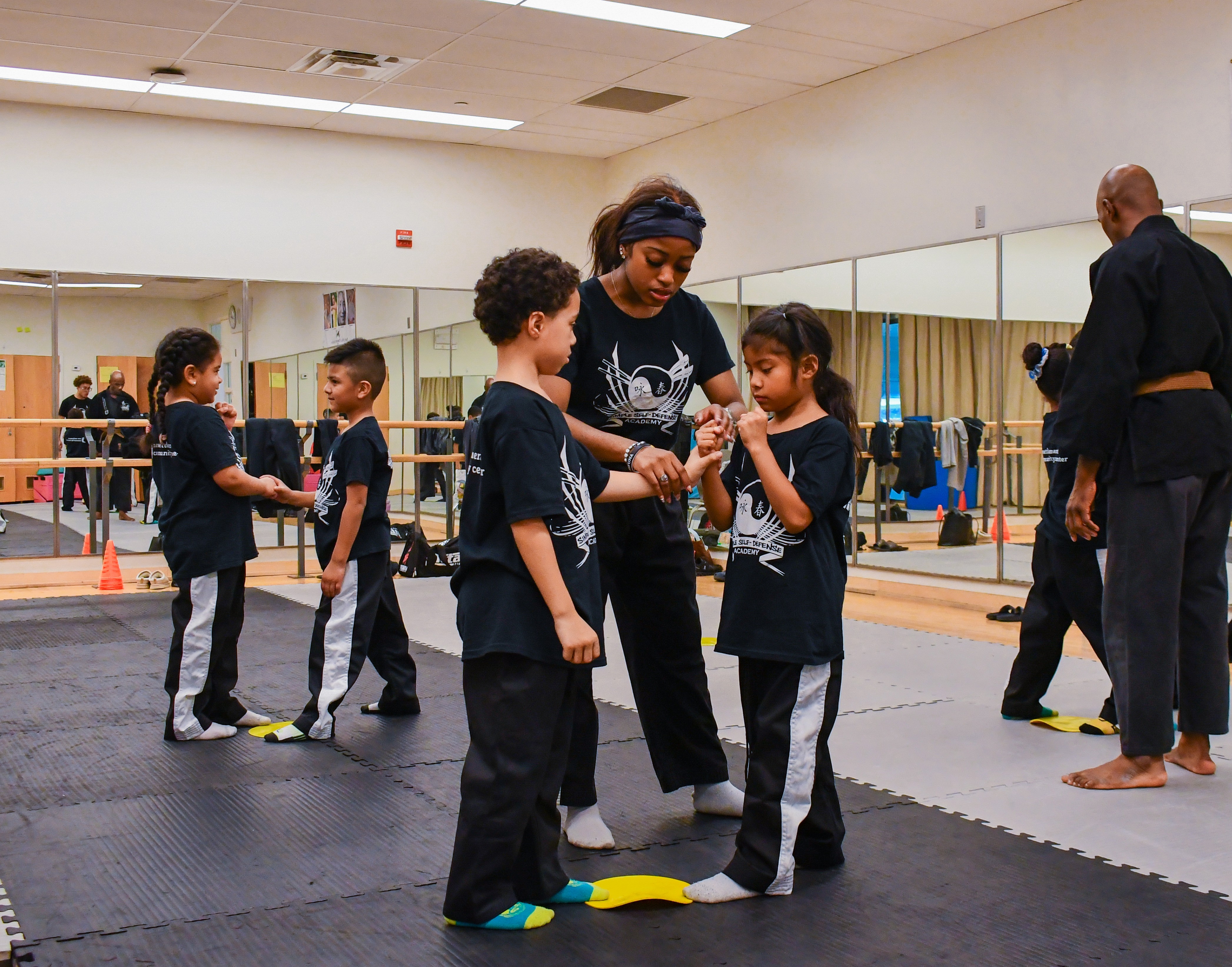


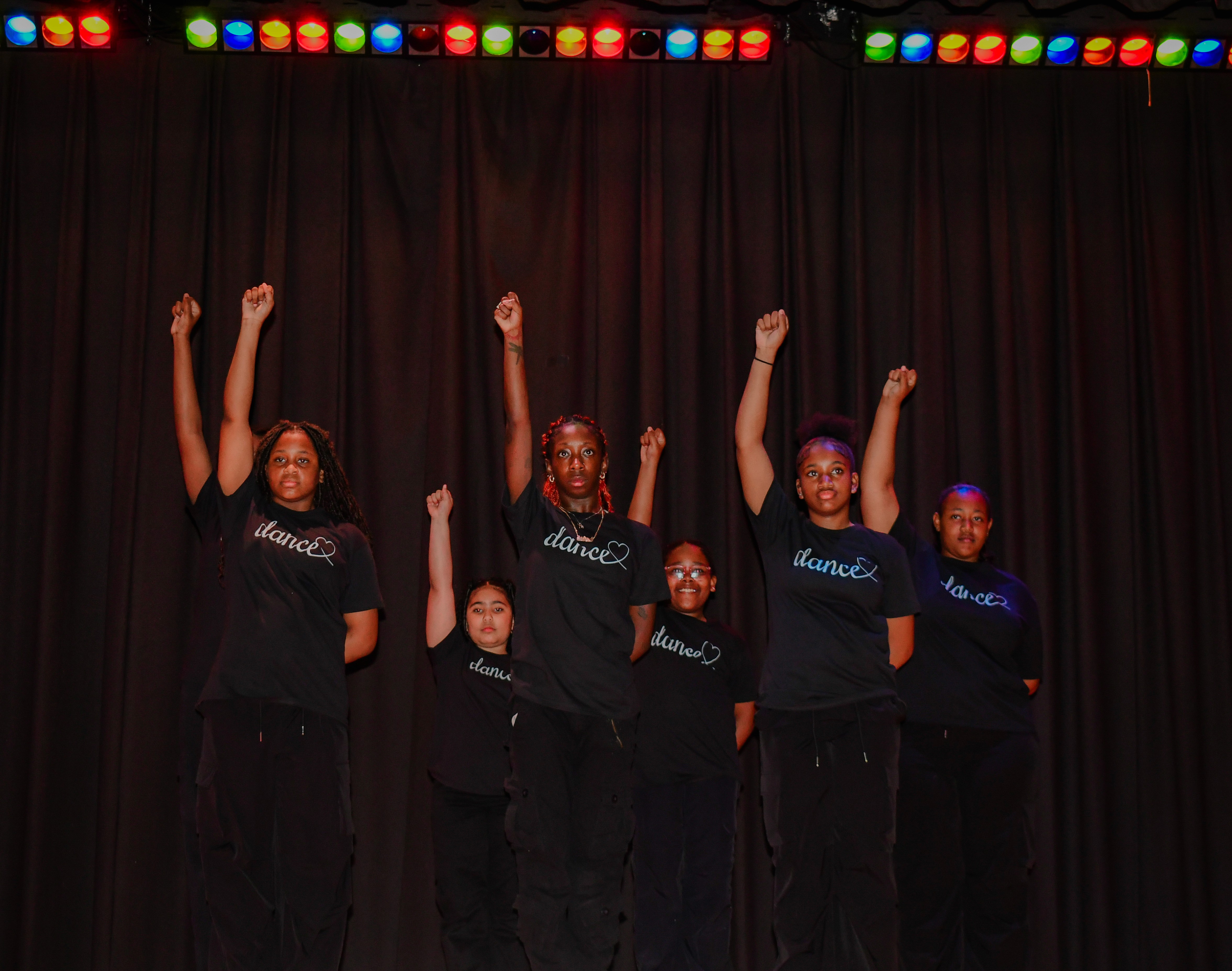
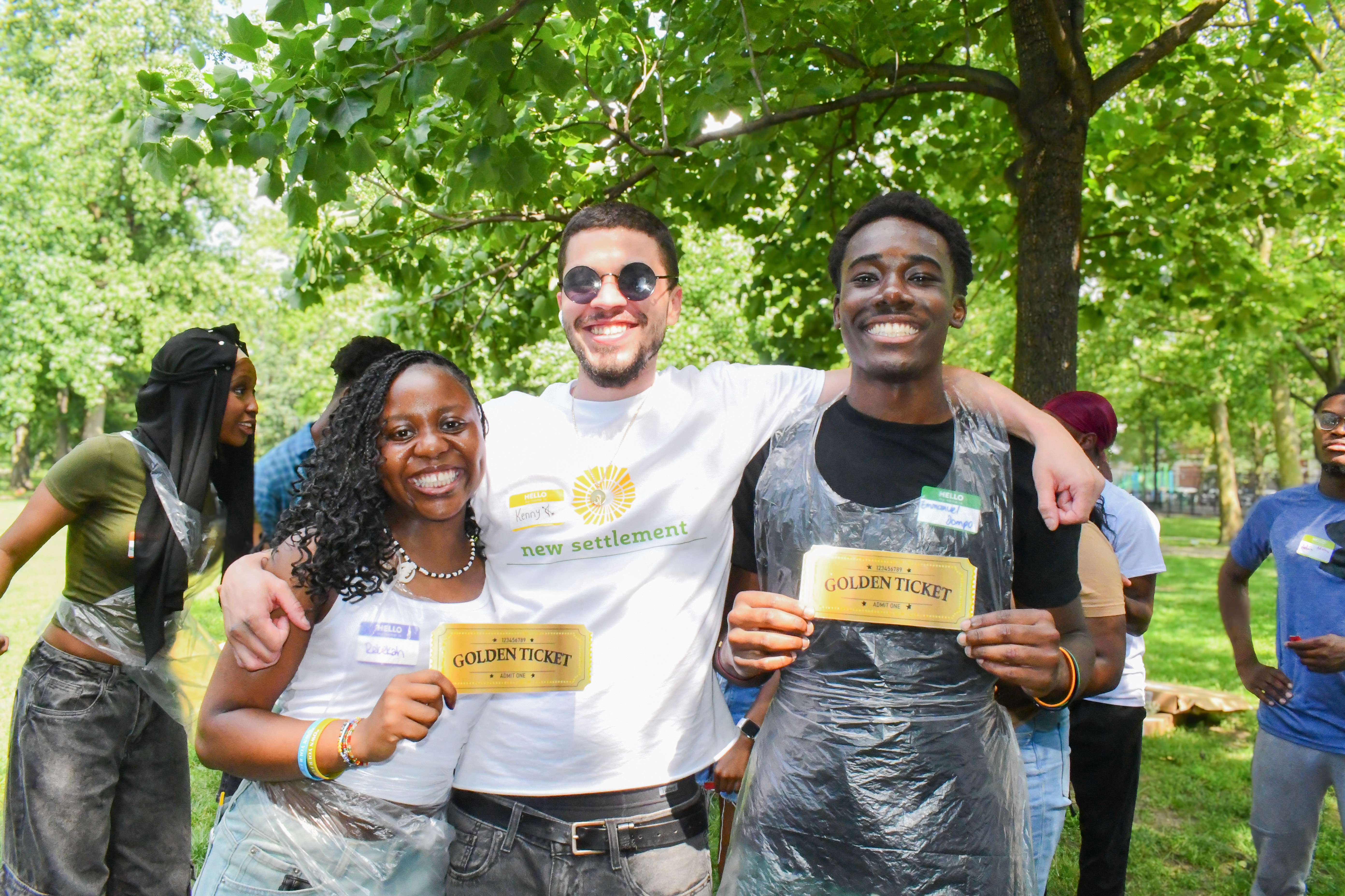
I approached photography as part of the brand message, focusing on images that clearly communicate what New Settlement stands for:
Staff supporting families and youth in real time
Kids actively participating in programs (swim classes, Mixed Martial Arts, gymnastics)
Community events that show energy, care, and connection
These photos made the mission easy to understand without needing a lot of text, and they helped the content feel real and relatable to the people New Settlement serves. By consistently using photography, the feed became more cohesive, trustworthy, and aligned with the message New Settlement wants families to feel when they see the brand.
#02
Improved Visual Design
I also knew New Settlement still needed graphic posts to promote events, but the existing designs were hard to read and packed with extra information. The hierarchy was unclear, and too much extra information made the key details easy to miss.
I fixed this by redesigning the graphics with a modern, parent friendly approach using cleaner layouts, easy to read fonts, and on brand color. I also simplified the copy so the most important information stood out first, making each social media post faster to understand.
Before
After


#03
Email Marketing
New Settlement’s emails were reaching a large list, but the message wasn’t turning into enrollments the way it should. Spots in key programs were not being filled, and that wasn’t just a marketing problem to me. It meant families who could benefit from affordable programs weren’t being reached in the right way, and kids were missing opportunities that support confidence, health, and structure.
That’s why I focused on email marketing. With 10,000 subscribers, the average open rate was only about 25%, which signaled that people were either not noticing the emails or not feeling pulled in enough to open them.
I approached it like a campaign, not a one-off announcement. I upgraded the visuals for each program and designed emails that made the value obvious to a parent within seconds. For example, I created a clean one-page layout that highlighted the benefits parents care about most, using strong hierarchy, colorful design, real photos, and a simple benefit section at the bottom. Even when people already “know” there are benefits, seeing them clearly laid out makes the decision easier.
#04
Improved Photography
Photography became one of the most important parts of strengthening New Settlement’s brand because it instantly showed the real story behind the work. Graphics can share information, but photos build trust. They show real people, real programs, and real impact, which makes the organization feel more credible and more human.
All of the photos used for this strategy came directly from me. I attended events in person, documented programs firsthand, and captured the moments that best reflected the mission. That mattered because it kept the visuals authentic and consistent, instead of relying on stock images or random photos that don’t match the organization’s voice.


The pastel backgrounds were chosen to keep everything light and friendly while letting the ice cream texture stay the hero. They also give the brand a modern, pop style that feels fresh instead of traditional. I paired the colors with bold, sticker like typography and thick outlines to make the flavor names feel loud in a good way, almost like packaging you would see in a trendy shop or on social media. That outlined, cutout look adds energy and makes each flavor label feel like its own graphic moment.
Even though the colors shift by flavor, the system stays consistent through repeated elements like the same cone layout, the drip detail, and the Glacine mark. That balance is what keeps it playful without looking messy. It feels fun and expressive, but still designed and organized, which is what you want for an ice cream brand that needs to stand out fast.
Print Design
Ecommerce
SaaS Website
Email Marketing
Branding
Photography
Ready to Start a Project? Let’s Collaborate!
Print Design
Business
Visual Design
Logo Design
Consistant
Branding
Print Design
Ecommerce
SaaS Website
Email Marketing
Branding
Photography
Ready to Start a Project? Let’s Collaborate!
Print Design
Business
Visual Design
Logo Design
Consistant
Branding
Ready to Start a Project? Let’s Collaborate!
Print Design
Business
Visual Design
Logo Design
Consistant
Branding